The problem
Hillrom's design teams were working in silos — each product with its own patterns, its own components, its own interpretation of the design language. Designers were spending cycles re-solving the same visual problems instead of focusing on harder UX challenges. There was no shared source of truth, no way to ensure consistency across products, and no foundation to build on as the company grew.
Problem 01
Significant visual inconsistency across products — same patterns solved differently by different designers
Problem 02
Design time lost to low-value visual decisions that should have been solved once and documented
Problem 03
Teams working in Sketch and Axure with no shared source of truth — no way to maintain consistency at scale
Process
Rather than designing the system in isolation and handing it off, I built it with the teams who would use it. Buy-in had to come from participation, not from a presentation.
Step 01
Audit
Collected screenshots across all legacy products. Mapped every pattern, overlap, and inconsistency — documented what existed before deciding what should exist.
Step 02
Research
Studied Atlassian Design System, Microsoft Fluent, and IBM Carbon — to understand what decisions they made, why they made them, and what was worth borrowing.
Step 03
Build & workshop
Regular workshops with designers, PMs, and engineers — keeping adoption in mind from day one. Components were reviewed and validated by the people who'd use them.
Step 04
Document
A living Figma document with usage guidelines — not just what components look like, but when and how to use them, and when not to.
Design principle
A design system is only as valuable as its adoption. Building with the team rather than for the team was the only way to make sure people actually used it.
What we built
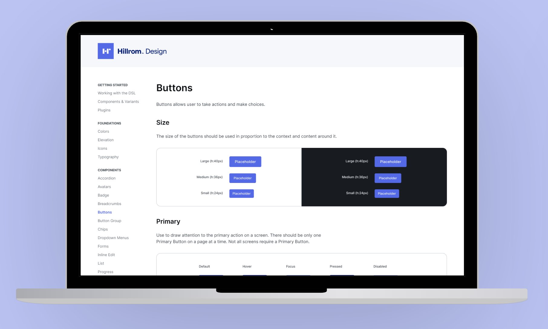
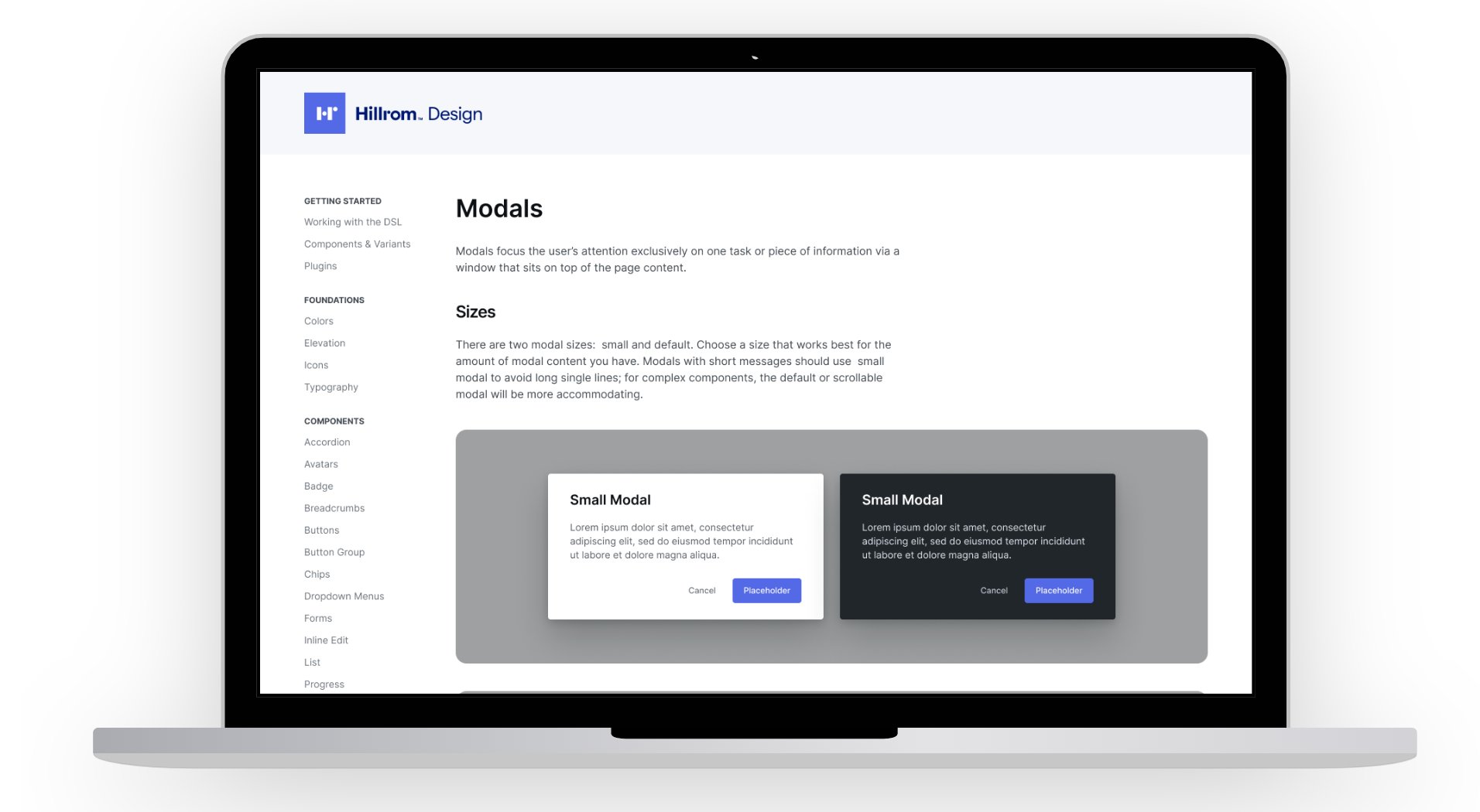
The system was built Figma-first — a decision that itself represented a shift in how Hillrom teams worked. Everything from color tokens and typography scales to complex components like data tables, modals, and navigation patterns was documented with clear usage guidelines and interactive examples.
Components were designed to work across Hillrom's product contexts — from clinical caregiver interfaces used in fast-moving hospital environments to administrative dashboards used by IT teams. That range required careful decisions about density, legibility, and interaction affordances at every level.


Outcome
New products
Figma-first
All new product work designed directly in the library from day one
Legacy products
Gradual migration
Existing products adopting components incrementally — no big-bang rewrite required
Next step
Full DS
Plans to expand into a cross-functional system spanning design, engineering, and product management
The work I'm most proud of here isn't the component library itself — it's the fact that teams actually used it, because they were part of building it.