The problem
When a loved one is hospitalized, families often feel completely in the dark. Nurses were fielding constant phone calls — sometimes up to five times a day from the same family — pulling them away from patient care at the worst possible moments. Face-to-face updates had become nearly impossible during COVID. Pagers were still in use in some operating rooms.
The cost was real on both sides. For families, the anxiety of not knowing is its own kind of suffering. For hospitals, poor communication is one of the most frequently cited reasons for low patient satisfaction scores — which directly affect government funding tied to HCAHPS ratings.
Hospital problem
Frequent family calls disrupt nurses during critical care moments — sometimes fielded by the nurse manager, the most important person on the unit
Business problem
Poor communication is a leading driver of low HCAHPS satisfaction scores, directly impacting the government funding hospitals receive
My role
I owned end-to-end design across the full product ecosystem — UX strategy, research workshops, user flows, prototyping, testing, and dev handoff. I worked directly with clinicians, patients' families, a product manager, a spec writer, and engineering — and kept stakeholders looped in through a shared Figma file from the earliest wireframes.
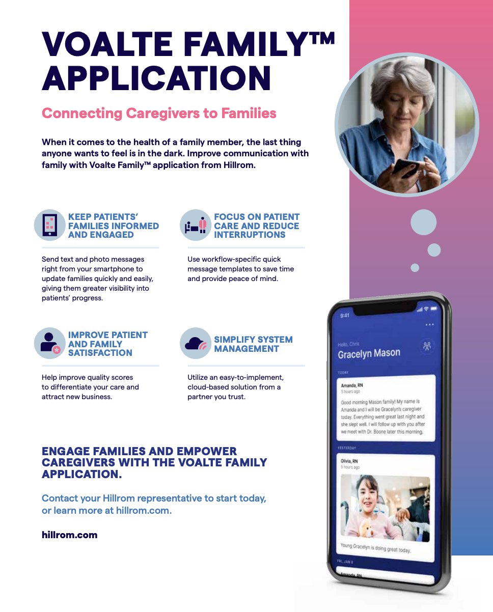
Surface 01
Family app
iOS and Android. Families receive real-time updates, photos, and video from care teams — wherever they are.
Surface 02
Caregiver app
Installed on shared hospital devices. Designed for speed in high-pressure, high-stakes clinical environments.
Surface 03
Web admin portal
Hospital administrators manage locations, quick message templates, family access, and HIPAA audit logs.


Research — three hospital realities
Rather than designing for a generic "family member," I grounded the work in three real hospital scenarios — ICU, Surgery, and NICU — each with distinct communication needs and anxiety profiles that shaped every design decision.
ICU — Zeus & his family
TBI patient, wife Olivia can't be present
Olivia calls the ICU desk up to 5 times a day. Children aren't allowed in the unit. Extended family can't visit from out of state.
Surgery — Li & Gina
Cardiac bypass, granddaughter in the waiting room
Gina walks to the reception desk repeatedly for updates. No way to share news with family members who aren't present.
NICU — Emerson & parents
Born at 29 weeks, 2 hours from home
Matt & Paul ask nurses to text photos daily — personal phones, not HIPAA-compliant, no structured system in place.
How Might We
Coming out of research, we ran a design sprint to synthesize what we heard into actionable problem statements. The team voted on the most promising questions to focus on — these four rose to the top:
How might we reduce the number of calls from family members into hospital units?
How might we invite family members that are not at the hospital to join the app?
How might we reduce the anxiety of patient family members during procedures?
How might we make a HIPAA-compliant app?
The bottom half of the sprint board maps the current experience for a family going through a surgery — from admission all the way to discharge. It made painfully visible just how many moments of silence and uncertainty families endure, and where the product had the highest opportunity to intervene.


Design principles
Principle 01
Less is more
One primary action per screen. Every screen supports a single action of real value. Keep nurses and families focused, not navigating around it.
Principle 02
Minimize typing
Bracelet scanning pulls patient data automatically. Quick message templates reduce friction for common updates. Nurses enter the bare minimum.
Principle 03
Text legibility
Both apps are used by a wide age range. The app needs to work for a 70-year-old grandparent on a small phone in a waiting room.
Key flows designed
Flow 01
Bracelet scan enrollment
Nurses enroll a patient by scanning their medical bracelet — extracting all patient data automatically, no manual entry needed.
Flow 02
Family invite
QR code for families present at the hospital, SMS invite for remote family members. Research confirmed both paths were essential.
Flow 03
Sending an update
Text, up to 4 photos, or video. Quick message templates for common updates. Designed to complete in under 30 seconds mid-shift.
Flow 04
Family timeline
Persistent chronological feed of all updates. Families can scroll back through the full care history for the duration of a hospital stay.
What testing taught us


Photos and video weren't a nice-to-have — they were essential. Nurses and families both saw them as the primary value driver, especially in NICU where parents couldn't be physically present.
"I feel like a picture just makes some parents feel that much better when they can't be with their baby."
Emojis and casual templates were rejected by clinical staff. Thumbs-up reactions felt too personal and risked cultural misinterpretation in clinical settings. We removed them from the final design.
Early prototypes included the ability for families to reply to updates. User testing with nurses shut that down immediately.
"If there were families texting back, we'd be going crazy. It's pretty aggressive place in the OR, not a warm and cozy place to be."
Voalte Family is intentionally one-way. Nurses send updates. Families receive them. The timeline feed, persistent update history, and push notifications were all designed to make passive receiving feel like active engagement.
Competitive differentiator
The main competitor, Vocera Ease, limited updates to 30 seconds. Voalte Family's persistent timeline — where families can scroll back through every update for the duration of a hospital stay — was a meaningful product advantage that emerged directly from user research.
Impact
Launch
Sep 2021
Blessing Hospital (IL) and Avera Health (SD) — surgical procedures over 1 hour
Expansion
Feb 2022
UCSF Medical Center began offering Voalte Family in the NICU
Outcome
↑
Nurses reported improved workflow efficiency and faster, more reliable family communication
"I was able to talk with 2 families after the entire process and they loved the app. They loved they could be down getting coffee and still get messages. They also watched the board in the waiting room and felt it gave faster updates than the board."
"The mother has a hearing issue so talking on the phone is hard for her. She loved reading the updates."


Lessons learned
We could have done a better job capturing structured feedback from nurses post-launch. An in-app NPS or qualitative survey after several uses would have given us data to iterate on more quickly.
Families consistently mentioned wanting to reply — even just a "thank you" or "OK" to close the loop. My next step would be to explore message reactions as a lightweight response mechanism that doesn't open the door to full two-way messaging — respecting the clinical constraint while giving families a small moment of agency.